Letterbox
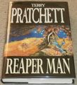
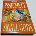
The “Letterbox” format was a style used for hardcover editions of the Discworld novels in the late 1990s, both for new novels and re-issues of older ones.
Published by Gollancz, they featured a block colour with Terry’s name and the title of the book above and below full-width versions of Josh Kirby’s cover illustrations. This resembled the “letterbox” effect used to show widescreen films on 4:3 ratio television screens, hence the name.
The style was discontinued for new novels when Terry changed to Doubleday as his primary hardcover publisher in 1998, but older books still published by Gollancz continued to be reissued in the format for a few years afterwards. Some omnibus editions were published in a similar format, and BCA seems to have issued some of the novels in a similar but smaller format as well.


